Bus Buddy
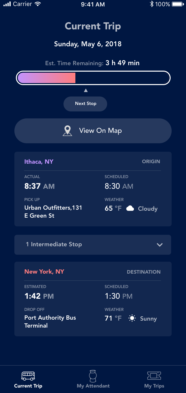
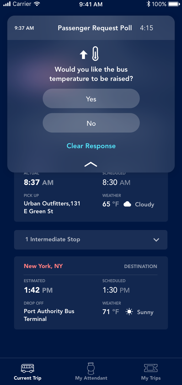
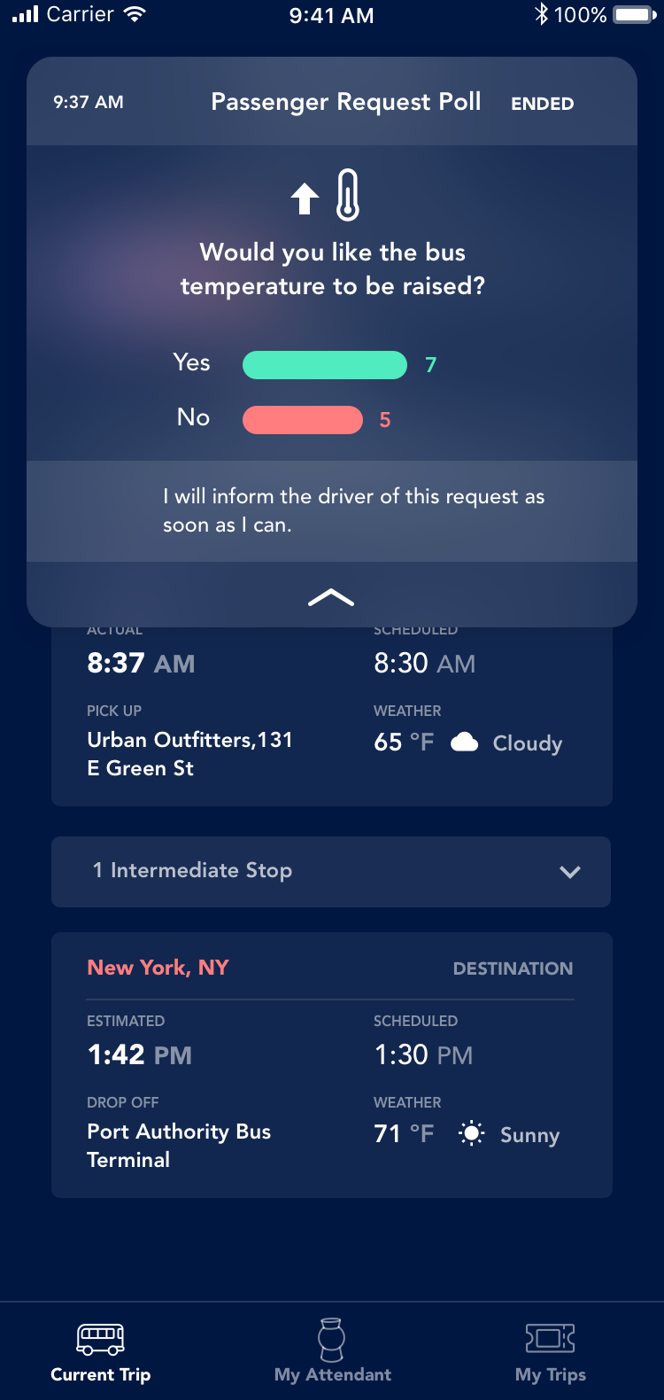
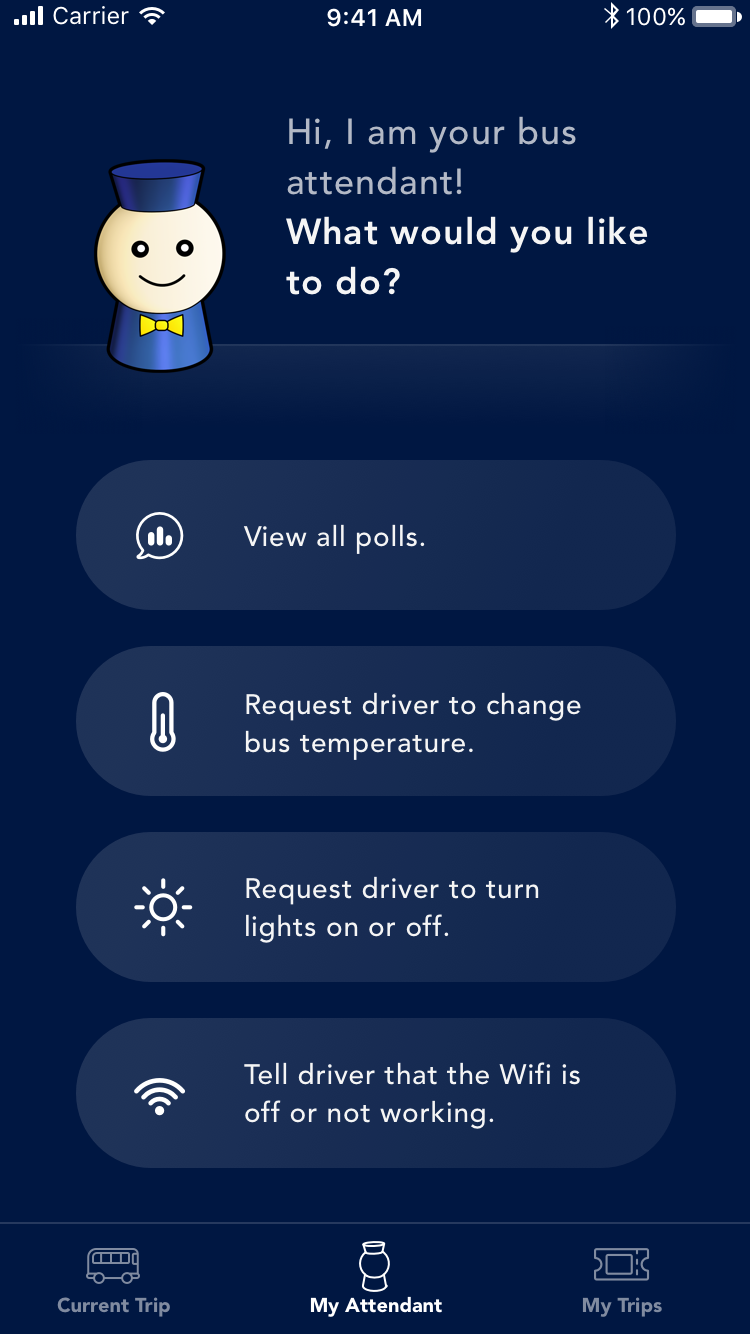
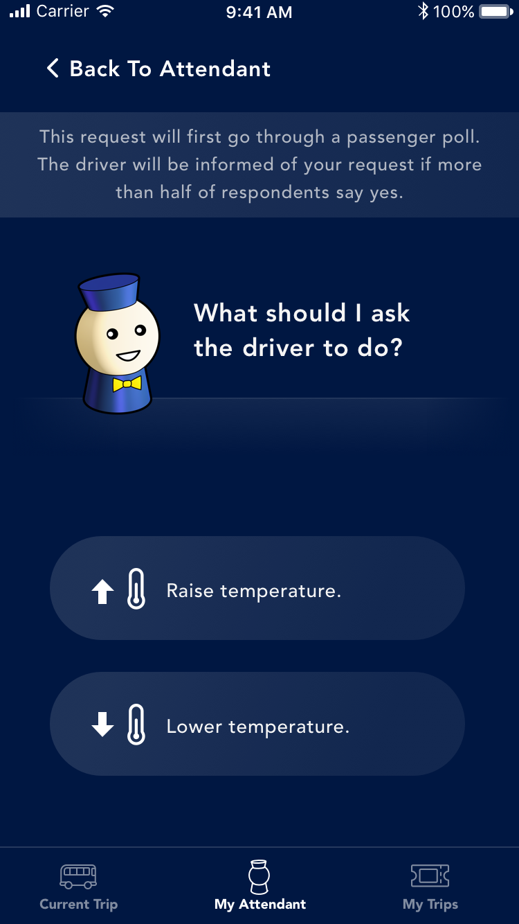
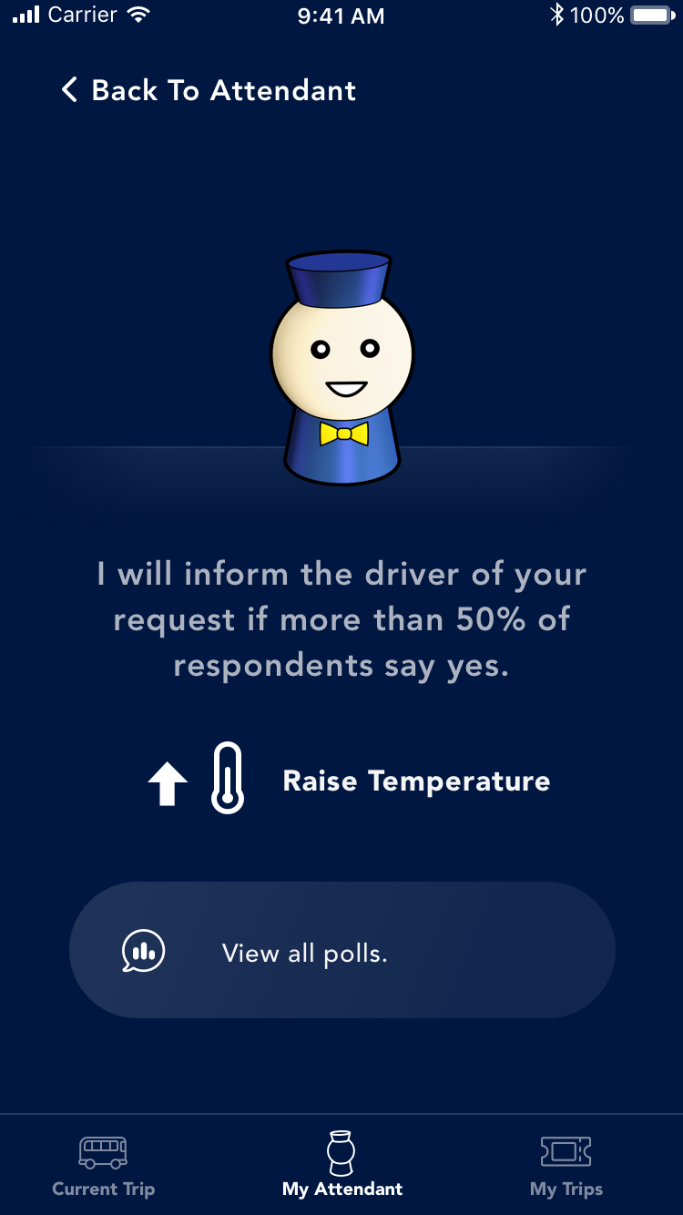
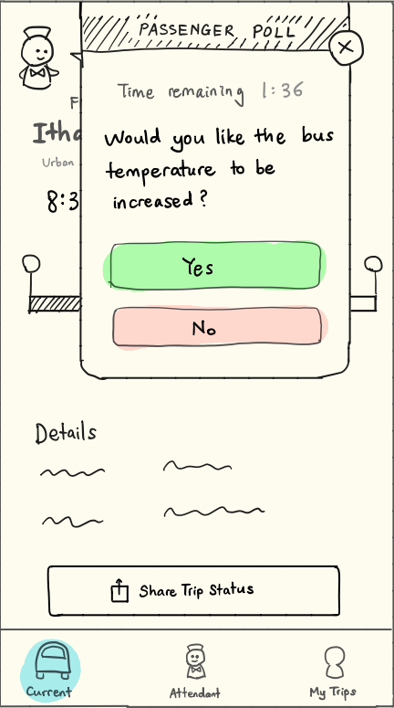
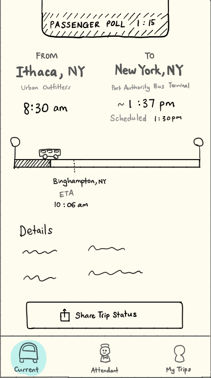
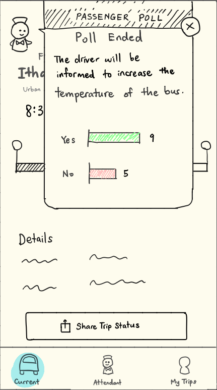
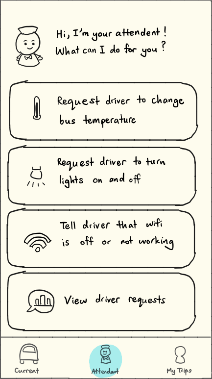
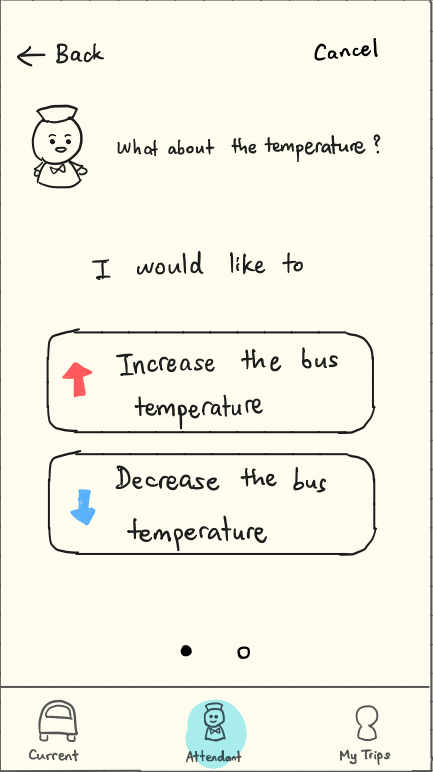
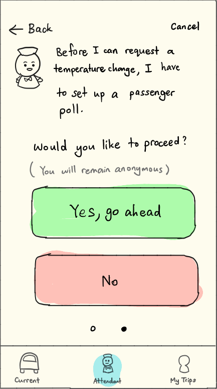
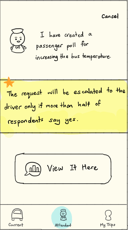
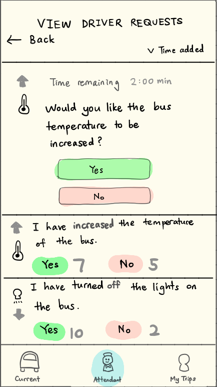
Long-distance bus travel is a routine experience for lots of people in the United States. In this project, I prototyped Bus Buddy, a mobile app that features a digital bus attendant. The attendant acts as a mediator between the passengers and the driver, managing passenger requests (e.g. increasing the bus temperature) through a polling system.
My Role
- Built all of the wireframes and prototypes
- Conducted user interviews, observation study, focus group, and user testing
- Conception and brainstorming
Team Members
Jesse Wu
Natasha Rojas
Kun Bi
Sabah Qazi
On This Page
User Research
Observation Study
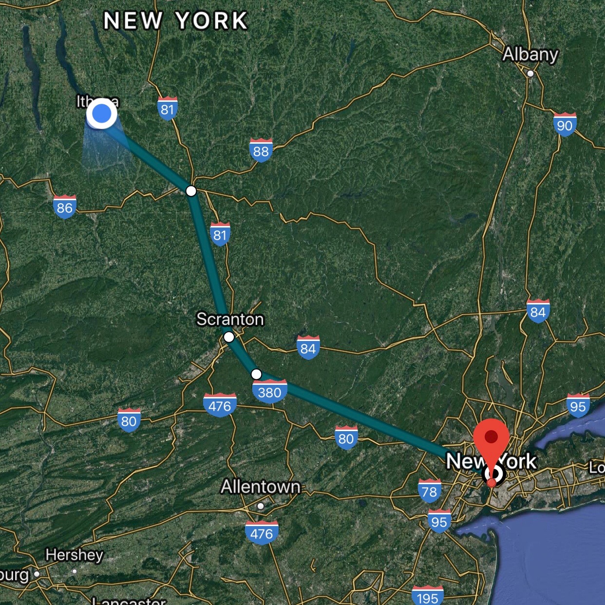
To explore the problem space, I began with a field observation study by boarding a 5-hour bus ride from Ithaca to New York City. Throughout the ride, I took down observations of what individuals were around me were doing. This particular ride was an early morning one that departed Ithaca at 6am in the morning.
Finding 1 : Most people were either sleeping or using their smartphones.
This could be due to the fact that the journey was an early morning ride. The amount of chattering on the bus also seemed to go down once the ride started.
Finding 2 : People took measures to avoid direct sunlight.
Passengers, especially those trying to sleep, were seen using their jackets, coats, and eye straps to shield their eyes from the sun.
Finding 3 : Interest in looking at scenery varied.
Some people were interested in looking at the scenery, while others were not.
Finding 4 : Phone used depended on the strength of the internet signal.
People used their phones less when Wifi or cellular signal was spotty.
Focus Group
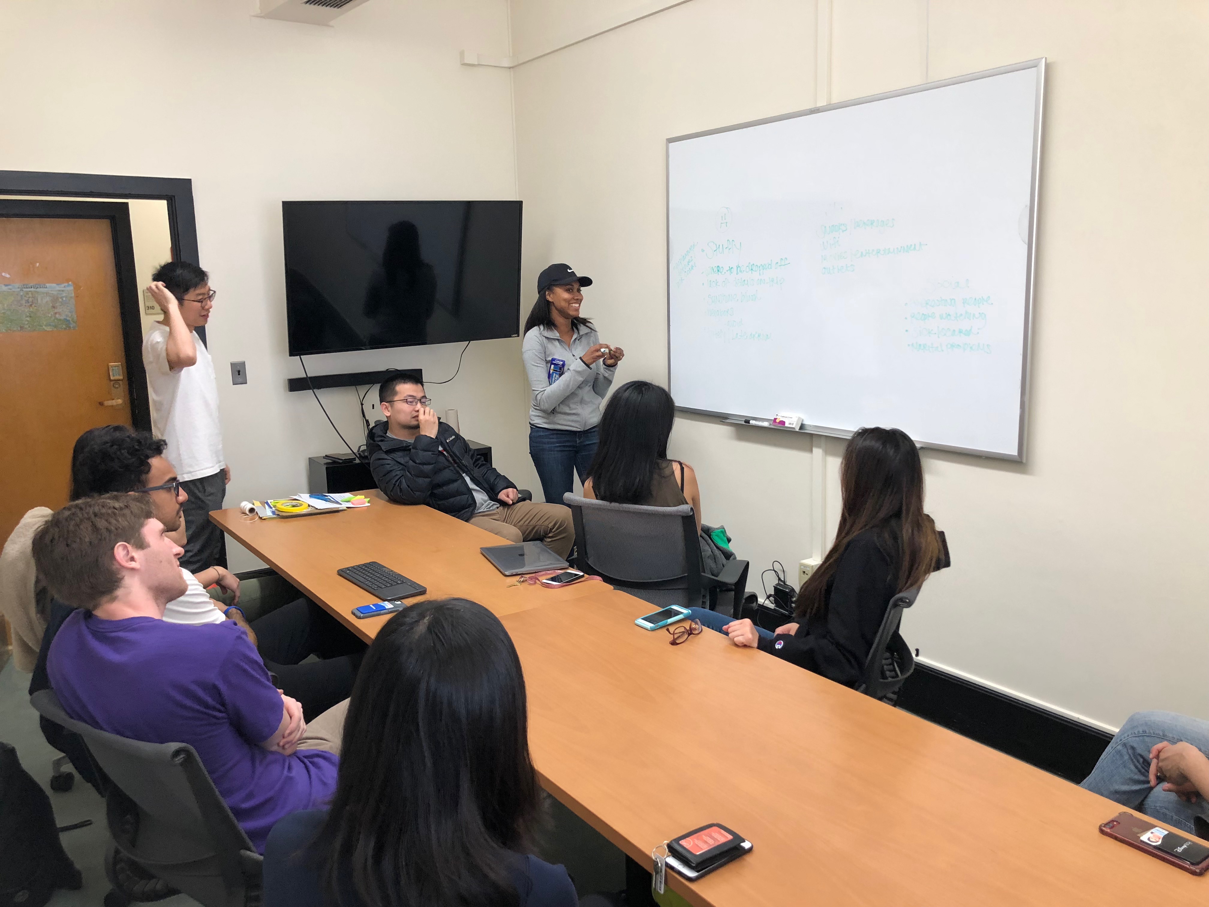
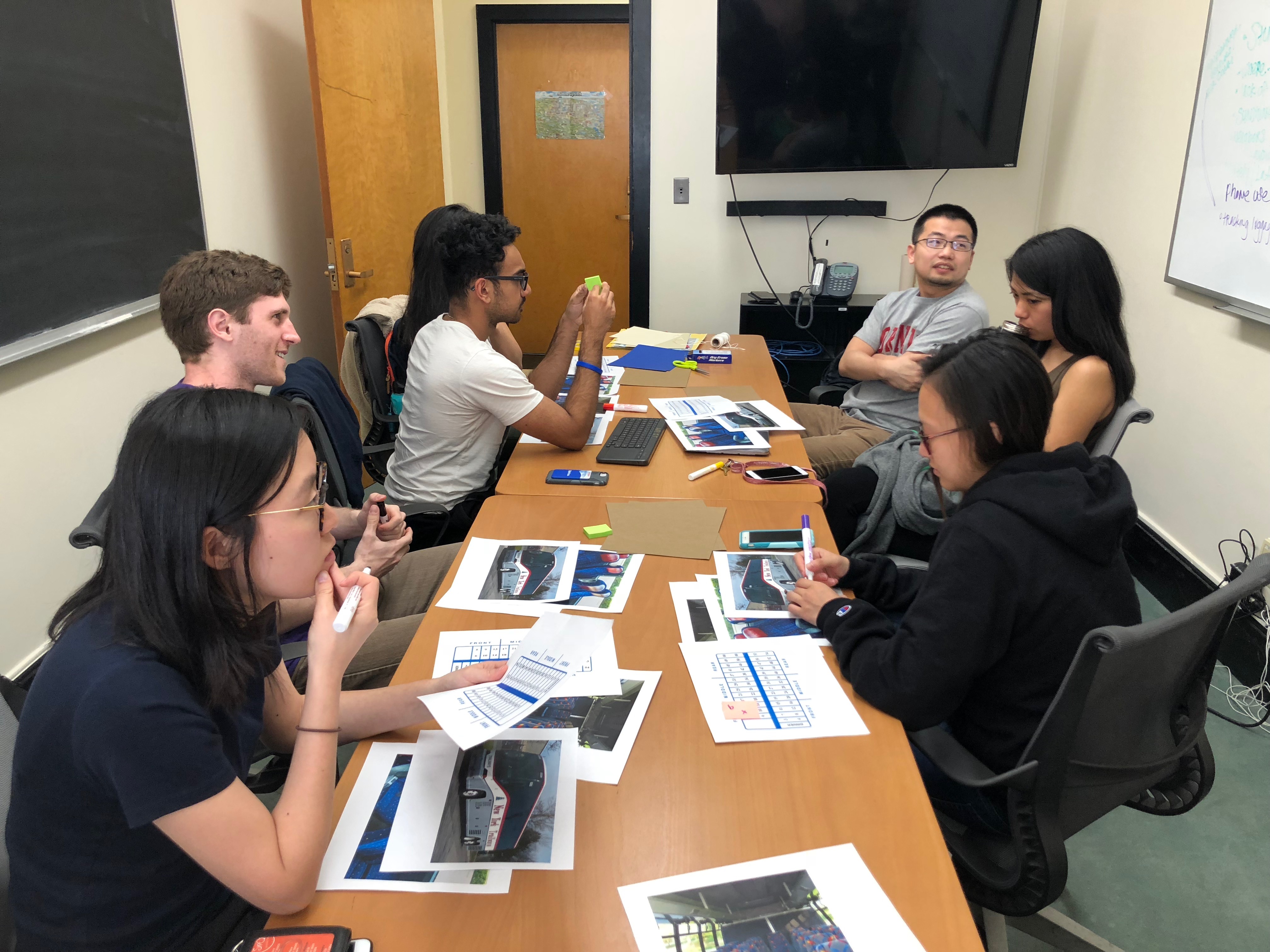
To more intimately learn about the experience of users who frequently took the bus, we hired 7 participants for a focus group. We introduced the design context and asked the participants to talk about their experience with taking the bus. We also encouraged them to actively participate in ideating and designing solutions for the problems they identified, providing them with materials such as photographs, seating charts, and sticky notes.

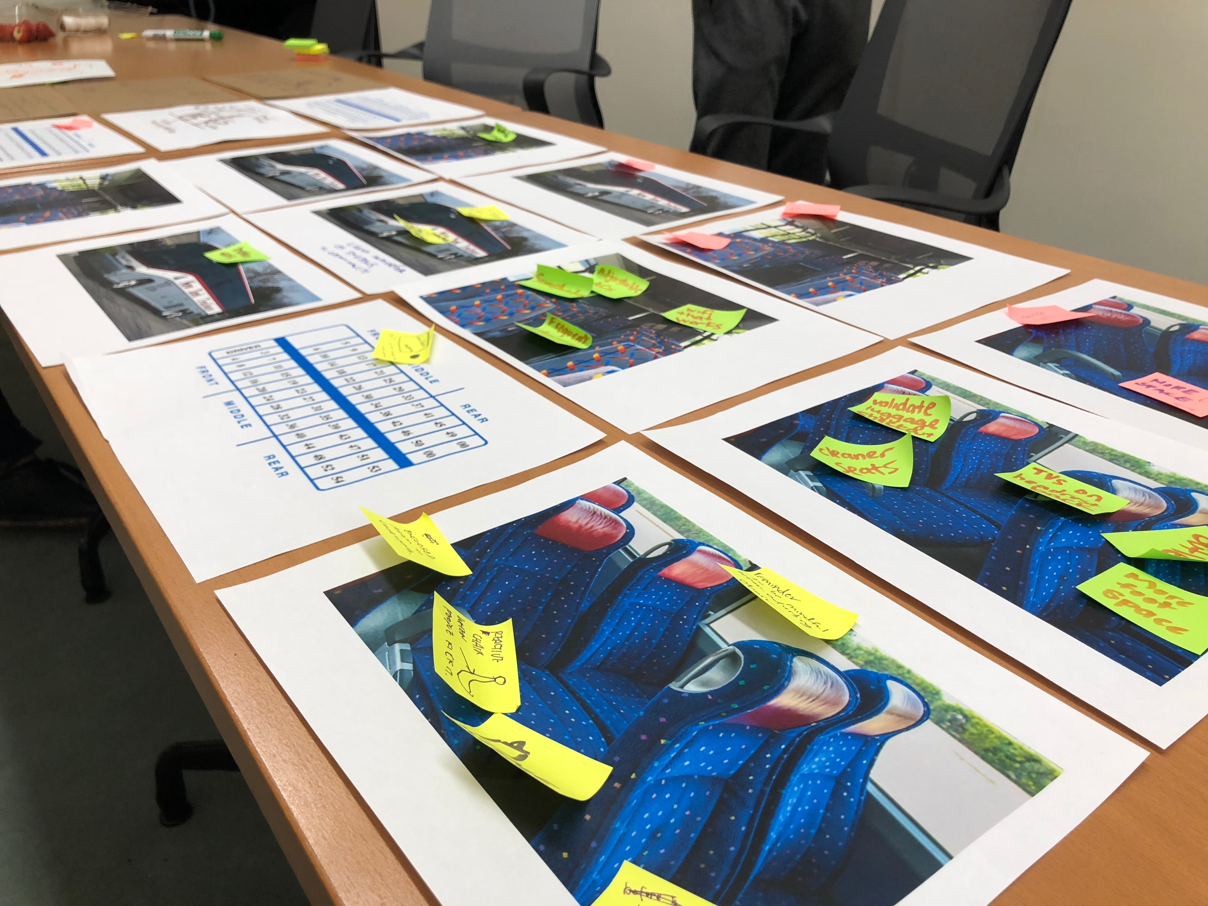
Finding 1 : Passengers want useful information.
Many of our participants mentioned the importance of trip information that is useful, accurate, and convenient.
Useful before and during boarding
- Which bus to board
- Where to board
- Bus delays
- Qualitative status, e.g. if the bus is waiting for someone
Useful after boarding
- Location
- Estimated arrival time
- Intermediate stops before their destination
Finding 2 : What comes before the trip is as important as the trip itself.
Much of the conversation was geared towards stuff that came before the bus trip itself, such as not knowing if one was at the right bus, or if the bus has already left.
Finding 3 : Passengers compared their bus experience with other travel experiences.
One participant mentioned that it was nice that there were flight attendants for air travel, and considered if this was a possibility for bus travel as well.
Design
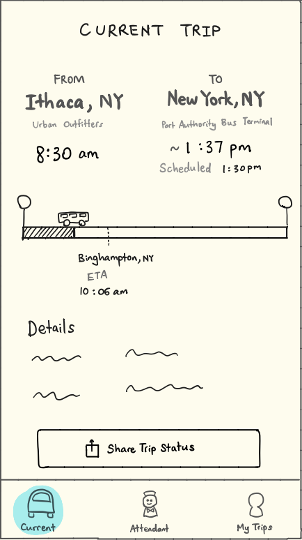
Low-Fidelity Wireframes
User Testing
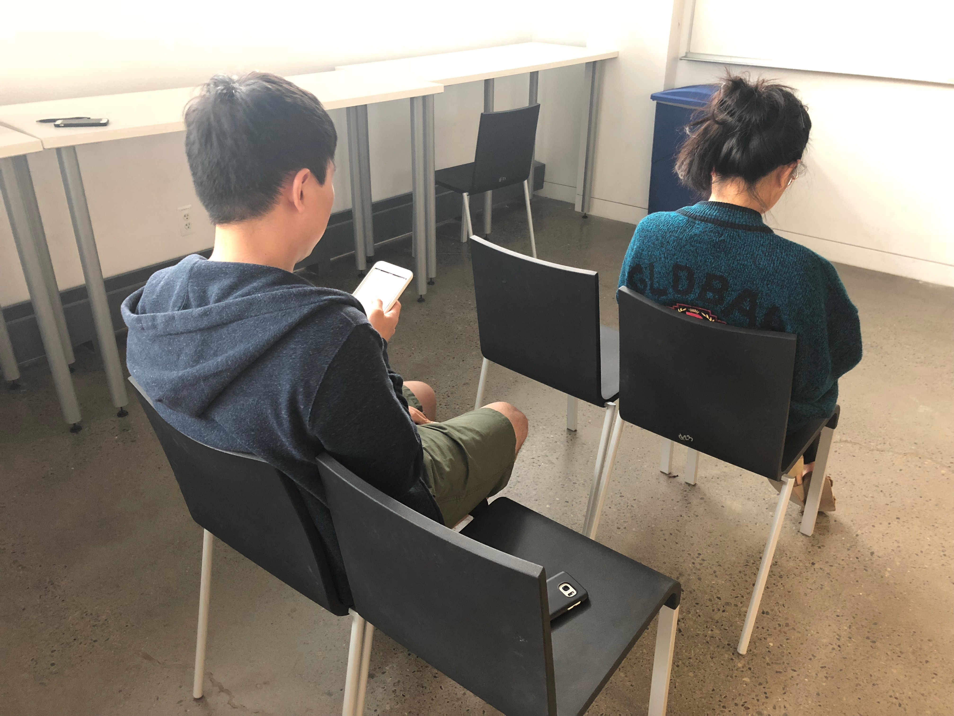
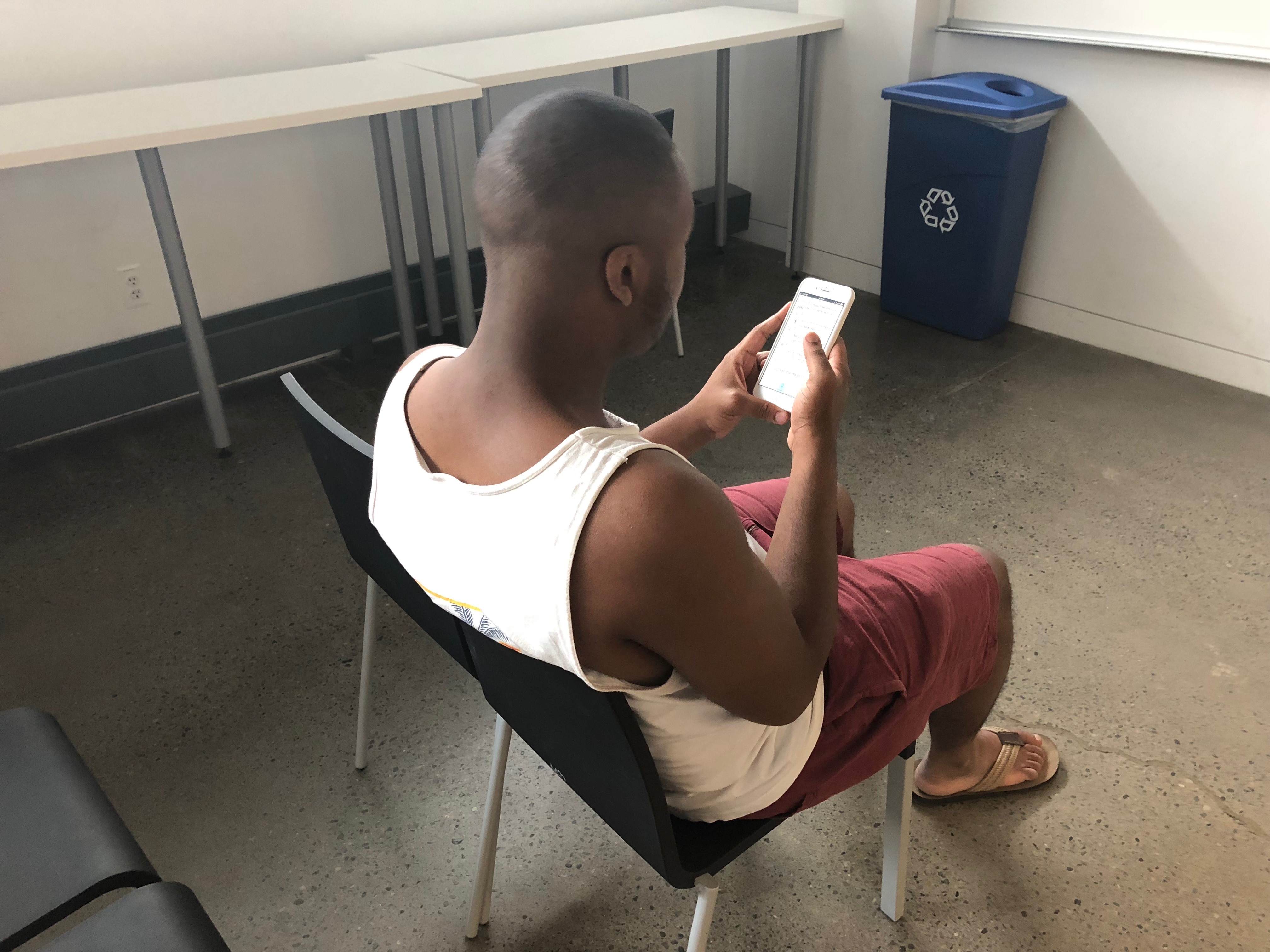
We tested the first iteration of our prototype with 3 users in a simple user test. To better simulate the environment of a bus ride, we arranged the participants to sit in a configuration that they normally would on a bus.
Findings
- Our users were generally enthusiastic about the idea of a bus attendant mascot. Adjectives used to describe the attendant were "cute" and "cool".
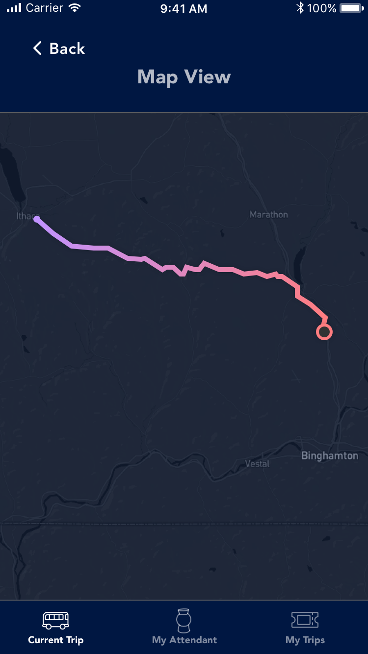
- Participants mentioned that the app allowed them to clearly see information about their trip, but could be improved through having a “map view” interface.
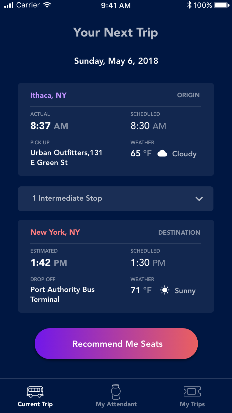
- Participants pointed out usability problems with how the information was displayed on the screen. For example, it was unclear which “Estimated Time of Arrival” (ETA) was the one for their destination, as there were several on the screen.
Final Deliverable
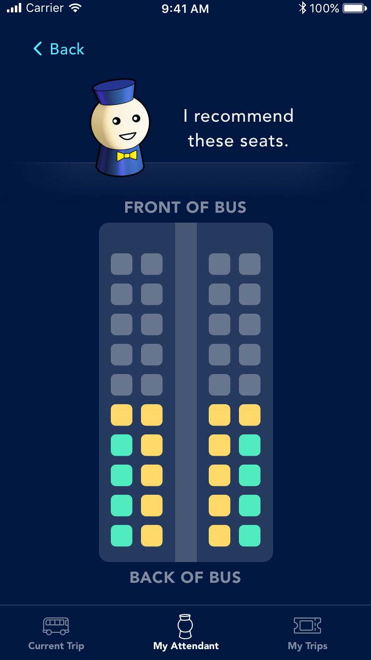
I crafted the high-fidelity prototype by taking into account findings from the user tests, as well as constantly discussing and gathering feedback from team members. Thought was also put into all the little UI details — for example, I chose a dark theme so that users can use the app in the dark while minimizing the disturbance on nearby passengers. Features were also renamed through user testing to sound more intuitive (e.g. View Driver Requests -> View All Polls), and added Map View while on a trip. Try it out here!
